Assignment 1, peer feedback, Task 1.4, Uncategorized

Final palettes and response to Peer Feedback

I received feedback from a number of fellow students on each of my palettes and the imagery and draft mood boards I posted for each (see previous posts).  This is a summary of my response in terms of refining the palettes and imagery plus the final palette I settled on for each trend.  The final imagery will be shown in my Trend Book for 1.6.
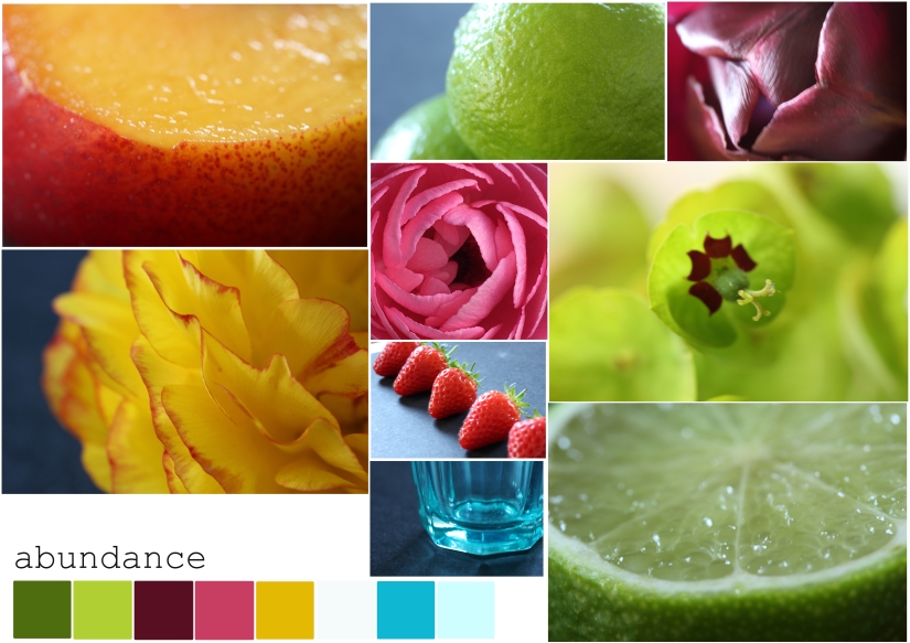
Abundance

Key points of feedback were:

  • good colours, lively, contemporary
  • sense of spring, freshness, ‘juicy’, tropical comes across – change the title of the trend?
  • remove the ‘harvest’ element of the description as it’s misleading
  • need more sense of abundance rather than details of individual fruits – images of growth to connect with this aspect of concept
  • individual colours questioned – do you need the blue?  pink? should a red be included? or colours could be added eg the slate blue from the background

I spent a lot of time working in my sketchbook and digitally testing out these ideas, taking additional images and refining the palette.  I narrowed down my written description, removing the ‘harvest’ element as this seemed to lead in a conflicting direction conceptually and in terms of colour and layout; researching the definition of ‘abundance’ led me to change the title to ‘plenty’ which is more direct.  I decided to keep the full range of colours as they capture the intensity of my original concept – it needs the blue, pink, yellow AND green – and because I am likely to be working in mini palettes in Part Two which will allow me to select from a wider choice.

abundance final digital palette
Final palette for Plenty trend

Given time I would get out and about with my camera to widen the range of imagery – more abundance and growth.  Further developments of the imagery could include:

  • images of market stall, fruit in baskets etc (thanks, Nicki) to give more variation to the close up imagery & suggest context; fewer flowers, different produce
  • pay closer attention to the background of the images so this reflects a key colour too

During my sketchbook work I started playing with materials and their qualities; the concept suggests smooth, shiny surfaces and pliable materials – acetate, liquids, plastics, the PVA ‘threads’ I created for IAP5 – and I found this very exciting.  This will be followed up in Part Two.

Believe

Finding suitable imagery was initially a struggle for this concept because of the abstract nature of the concept.  Feedback from my peers focused on the photos I was using but confirmed my colour selection, especially the decision to include the green as an accent colour.

To refine the palette I’ve focused on exploring the disconnect between the paint and digital palettes which was at the heart of the problem, and this has led me to imagery that better conveys the concept.  In developing my third palette, Protest, I found focusing on a single inspirational image helpful so for Believe I went back to my favourite image of a Krishna event and created a palette solely from this image to see if that clarified my thinking; I then added this palette to some of my existing imagery:

This is a more harmonious, simple palette than my original.  However, in working purely digitally I felt I’d lost touch with my original concept; returning to paint and sketchbook I looked at the gap between digital and physical colour (exaggerated further by the photography here).  I returned to the gouache swatches and realised that I needed to de-saturate the digital colours to achieve the subtlety I needed.  In particular, I felt that the quick abstract ‘paintings’ I’d done whilst playing with the gouache captured the warmth and texture I wanted for the concept which are missing from the digital version.  Although the palette of harmonious pinks from the Krishna image is very attractive, I’ve decided to stick to the more challenging palette I originally generated (see gouache and desaturated digital palette below).

Screen Shot 2018-06-28 at 16.34.33
Sketchbook work – refining Believe palette
Believe final moodboard #3
Final Believe palette with selected imagery

Protest

For feedback on this trend, comments on the CC email thread supported my choices and imagery, while questioning the precise tone of red, suggesting it could be stronger, more blood-like.  The palette is described as ‘strong’ and ‘exciting’; one student, Claire, made really helpful suggestions re texture – glossy for the red and concrete/matt/linen for the greys.  In addition I had a wonderfully detailed 20 minute discussion with fellow student, Inger.  My notes are below:

In particular, this discussion confirmed the nature of the red I’d chosen – what Inger described as ‘French red’ for passion not USA stars and stripes red.  My main concern about the palette had been not wanting to evoke the nationalism that can be connoted by flags, whilst acknowledging that the flag is often used as a symbol of resistance and protest – Inger pointed me to Delacroix’s ‘liberte’ image.

Screen Shot 2018-06-27 at 18.41.41
La liberté guidant le peuple, Eugene Delacroix (1860)

This discussion also made me wonder whether to change the title to ‘Resist’ as I feel this maybe more accurately describes what I’m thinking of but in the end it feels rather passive compared to ‘protest’.  However, I’m keen to avoid any rather brutal or simplistic harshness in the colours, hence the red which I hope avoids direct connotations of bloodshed or violence.  Our discussion also confirmed the exact shades of grey I’d chosen (which took a very, very long time to mix!) – as well balanced between cool and warm, and inherently ‘calm’ rather than ‘soft’ as the latter would undermine the protest element.

My explorations of this palette led me almost immediately to non-textiles materials and 3D work (see mood board) and I am keen to explore this further in Part Two.  My final Protest palette remains unchanged:

Protest final digital palette
Final Protest palette

Conclusions and evaluation

I think I have a varied but coherent trio of palettes that feel quite ‘me’ – placing them alongside each other is quite exciting.  Each is distinct – Plenty is more saturated, Believe more subdued and muted and Protest more of an exploration of tonality with accents:

all three final palettes
all three palettes from Part One

What I’ve learned from this process:

  • feedback is very helpful in the developmental stage; face to face discussion is invaluable
  • trust my instinct re colour and keep a focus on the original concept/descriptive words to ensure later work stays true to this especially once I move into digital interpretations
  • I need to develop my digital skills to find a way to express concept, texture and subtle ideas – initially, moving into digital palettes led me to oversimplify and wander a little from the original concept (eg the ‘juicy’ element of the first palette, being drawn by some lovely photos; over-saturating the palette for Believe); I can do this through layering, using my graphics tablet for more free drawing and generally focusing on expressiveness and experimentation rather than the visual ‘perfection’ that digital work tends towards – especially, this is the way I’ve used digital in my day job, for ‘professional presentation’ and photography rather than expressiveness
  • keep playing with materials – as soon as I focused on materials (fabric, paint, acetate) for each palette, it came alive and became much more playful and exciting and allowed me to express quality through form and texture as well as colour; see digital as a material and process rather than simply a presentation device
Assignment 1, peer feedback, Task 1.4, Uncategorized

Part One Trend #1 Abundance: Request for Peer Feedback

We are asked to obtain peer feedback on the trends as we develop them for Part One.  I’d really appreciate your comments on this first trend especially:

  • the colour palette
  • the title and description of the trend
  • how well the imagery conveys the trend ‘Abundance’.

Description of trend:

‘Abundance’ celebrates the bounty of the natural harvest: the colours, the nourishment and the simple slow pleasures of working in harmony with nature.  It brings the order and exuberance of field and market together and into our lives with a freshness that rejuvenates us.


Abundance moodboard
1.4 Draft mood board for ‘Abundance’ trend


Abundance palette greyscale
1.4 Abundance palette as greyscale


Fabric wraps:


Thank you.

Assignment 1, Task 1.4, Uncategorized

1.4 Develop a Visual Response

Aims  Next we are asked to select a definite title for the trend then develop visual imagery in the form of a collection of photographs.  These should reflect the mood and palette of the trend through composition and framing as well as content.

Title

I selected the initial images from the Guardian site firstly for their photographic qualities – colour, composition – and secondly for the trend they seemed to suggest, namely of the readership looking for a certain amount of escapism or reassurance about a world of natural or traditional living beyond that presumably lived by most of its readership.  I am uneasy about a reading of the images that ignores the actuality of these ways of life and the possible hardship and poverty; I don’t want to glamorise the reality of farming in the countries depicted.  However, it does seem a valid ‘trend’ that we seek imagery like this, perhaps because of the contrast with the rest of the photography on the site/in the news which is predominantly grim, urban and colourless (see my next trends!) or staged.

The care and attention to detail in this kind of photography – and in the farming itself – also relates to mindfulness, crafting and slow processes; taking my own photos involved getting close to the produce, examining and appreciating tiny details of structure and colour.

I need my title to reflect these elements.  I rejected early ideas involving words like ‘exotic’ and ‘escape’ or ‘bounty’ as not representative of the reality behind the photos.  I toyed with variations on ‘harvest’ and ‘fruitful’; I also wondered about ‘exuberant’ which felt too random and ‘contemplation’ which doesn’t quite capture the intensity.  Which is how I ended up with ‘Abundance‘.

Research

To supplement by ongoing research on trend sites, I turned to glossy magazines and interiors companies.  Many lifestyle magazines present trend mood boards each month with a combination of swatches and objects and these proved very useful.  Companies like Farrow & Ball and Annie Sloan also show trends in this way.  I also came across a food article which presented colours right from my palette – this encouraged me in my colour selection but also gave me ideas for my own layouts – sketchbook pages below.

Imagery

As well as the colours, the elements of the trend that I wanted to capture in my photography included:

  • densely packed even crowded to give sense of abundance – I could achieve this through super close ups and closed framing
  • ordered, as in the rows of planting or harvesting or the produce displayed in the image from the Malaysian market – I could achieve this by balanced composition, not too many elements in any one image, and by organising the content of a shot in a symmetrical and balanced way; I can also include suggestions of the role we play in gathering and utilising the harvest – initial ideas included jars, baskets, even tools
  • intense but in a calm rather than chaotic or disturbing way – I could achieve this through lighting and selecting single colour details so that the eye can focus on one colour at a time
  • richness, a sense of natural bounty  – I could achieve this through lighting and selecting rich textures and surfaces rather than any that are worn; also by suggesting food and cooking/bottling of the harvest with utensils not just the produce itself; produce will be picked rather than growing for the same reason
  • freshness – the idea of just-picked produce – I could achieve this through selecting high quality produce to photograph and using lighting to highlight soft, fresh skin and the juice of fruit

I used my initial photos to start me off:

Flowers allow me to capture the right colours but also give a sense of abundance.  I selected details that suggest many layers unfolding, multiple flower heads and also the interiors to suggest fertility and ongoing reproduction.

For my images of fruit, I chose to include only one fruit in each image to intensify the focus on colour and detail; I used the lighting to highlight the freshness and rich juices and the glowing skins.

To introduce an element of the harvest I used a Kilner bottle; for the blue, I had to rely on a glass – ideally this would also be a bottle or jar.  Arranging the strawberries and taking longer shots here suggests an orderliness as well as rich harvest.  I used a black background to close in the space a little and give depth to the colours.

This is where it all went wrong.  I was pleased with these images; the range of items is rather limited and I couldn’t find a satisfactory way to introduce a textile element but I feel the images I have included do capture the trend.  What became very difficult was producing a flat plan or composition using more elements together.  This is a task I will need to return to but I’m including the best shot of a bad bunch here as I need to move on; after feedback on my palette I will re-attempt this.  I think the composition and content of the shot is OK but the quality of the background, lighting and overall image are poor technically and creatively.  This is frustrating as I do have some photography skills, multiple lenses and a tripod – what I don’t have access to is a professional backdrop or lights which goes some way towards explaining the disconnect between my image and those I’ve been researching.  So – I’ve included this shot as a demonstration of where I’m up to at the moment and how far I have to go before I can produce a professional colour book!

IMG_2718
1.4 Trend #1 developing visual imagery

Evaluation and Peer Feedback

How well does my work so far communicate my trend?  I’ve reflected on this in my commentary above.  We’re now directed to seek peer feedback so I will publish this and also post on the gmail thread for CC then record the feedback before finalising my palette and imagery.

I’ve created a mood board to communicate the trend plus a greyscale version of the palette to test tonal variation.  These are what I will put out for critique, plus the written description and fabric wraps – see following post.


Abundance moodboard
1.4 Draft mood board for ‘Abundance’ trend
Abundance palette greyscale
1.4 Abundance palette as greyscale